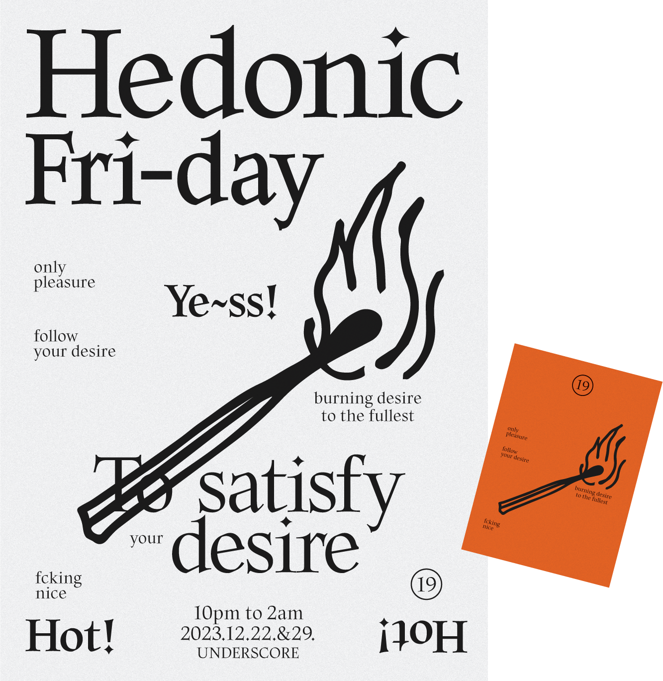
Hedonic Friday
Poster / Invitation / Dec.2023
Even a tiny spark keeps the embers burning.
Even a little effort makes flowers bloom.
Even a tiny spark keeps the embers burning.
Even a little effort makes flowers bloom.
︎︎


Forest Travel Guide in Korea
Book_ 147︎210, 192pgs
Book_ 147︎210, 192pgs
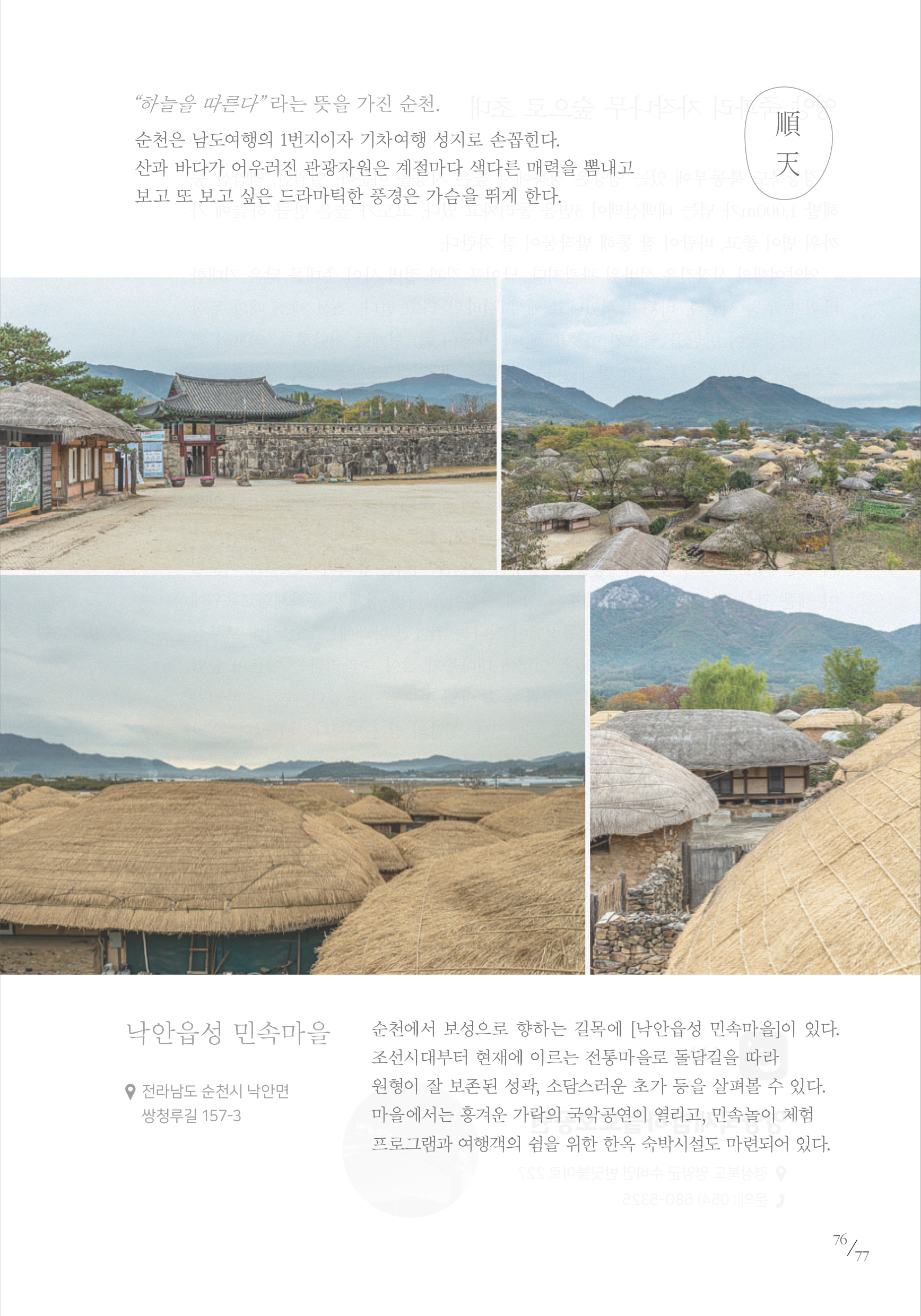
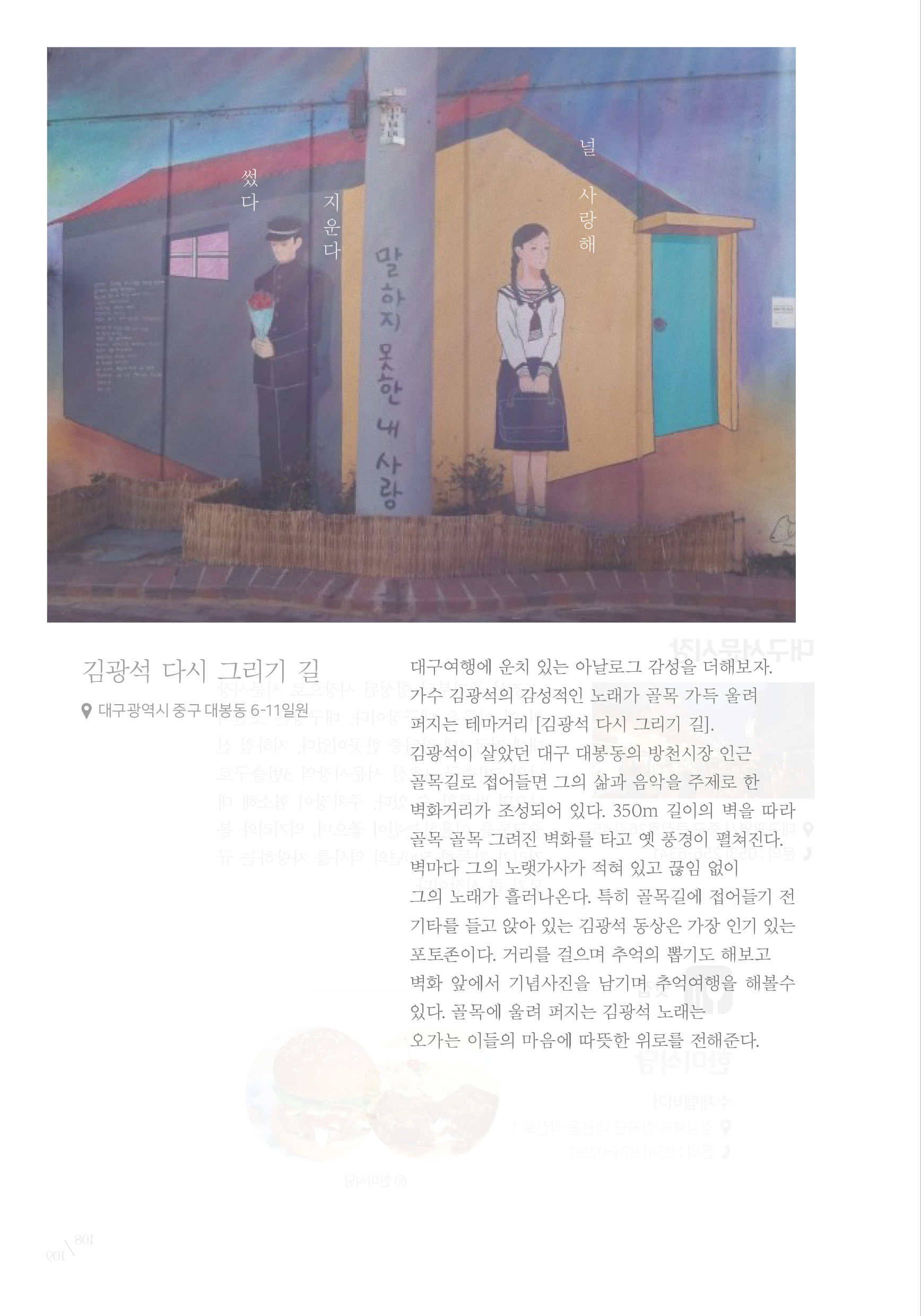
우리숲여행안내서는 전국의 산과 숲을 중심으로 각 지역의 휴양림, 볼거리(전통문화), 먹거리(향토음식)을 연계하여 다양한 코스를 소개합니다. 숲체험과 동시에 지역의 문화체험을 병행한 여행으로 국민의 건강증진과 다채로운 여가활동을 도모하기 위하여 산림청에서 발간하였습니다.
This book introduces four themed courses that blend Korea’s forest trails and nature experiences with the unique attractions of each region. Published by the Korea Forest Service, it aims to encourage health and leisure through forest-based travel.
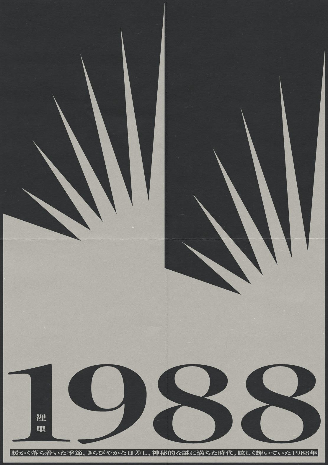

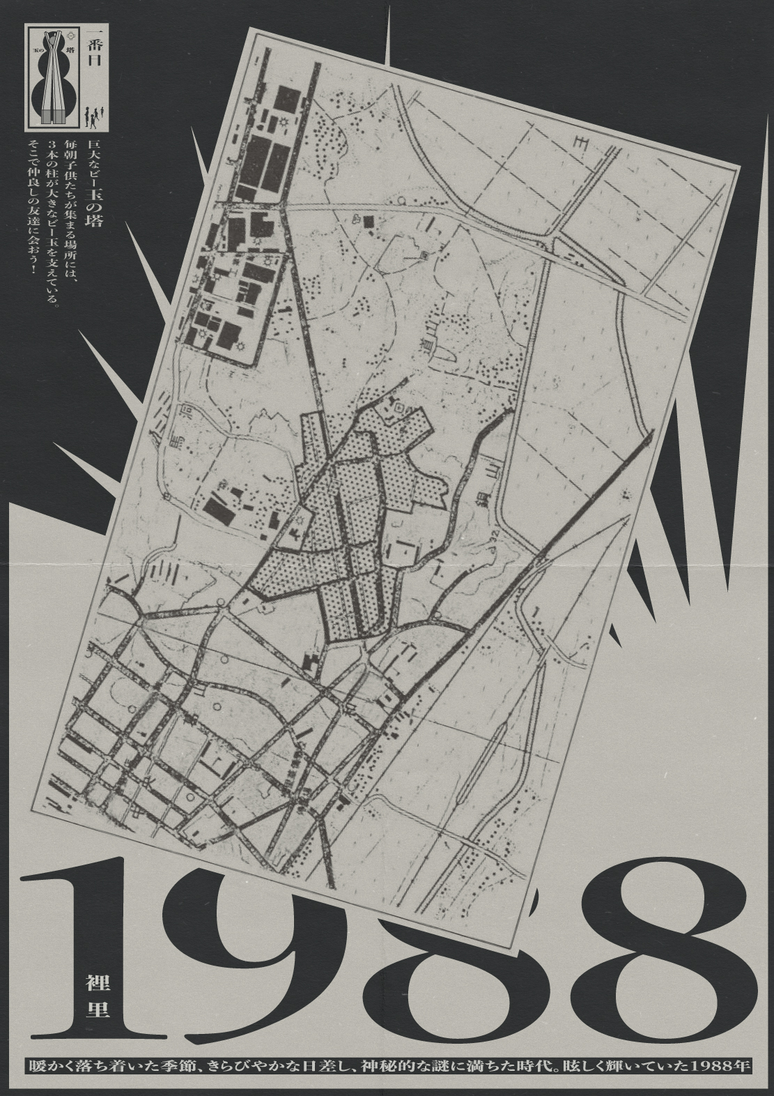


眩しい1988年の思い出
Poster / Quest card / Illustration / May.2021
眩しい1988年の思い出は、謎を求めて冒険に出かけたりした子供の頃の記憶を思い出させるプロジェクトです。おぼろげな昔の記憶の中でも純真だった子供の頃の思い出は、今も変わらず私たちの心の中で明るく輝いています!
Brilliant 1988 is a project that reminds us of our childhood days, when we used to go on adventures in search of mysteries. Even through the blur of old memories, the innocence of our youth still shines in our hearts.
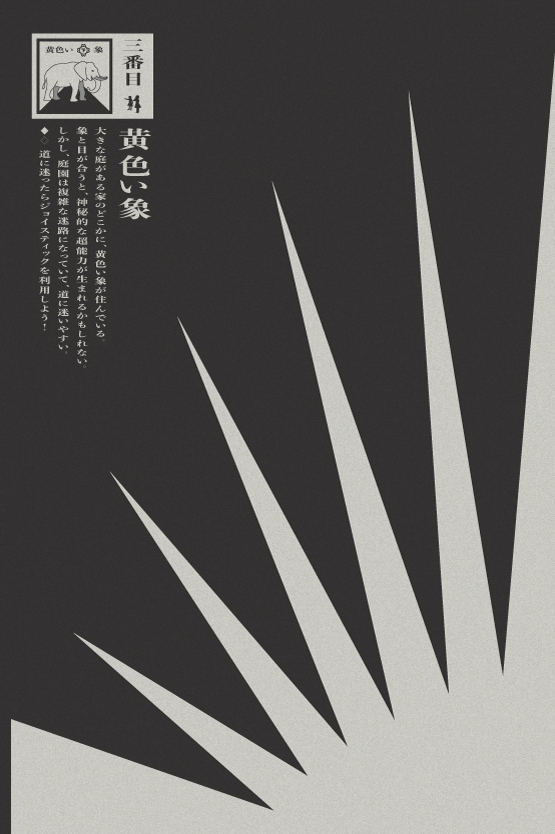
Brilliant 1988 has five quests! 1.GIANT BEAD TOWER: Every morning, children gather around a tower with three pillars supporting a giant bead. Go there and meet some good friends. 2.PEACH MINE: To the north of a peaceful village lies the Peach Mine. There, the fairies drink the elixir of eternal life. Solve the fairy’s riddle to earn a sip of this magical drink. 3.YELLOW ELEPHANT: Find the Yellow Elephant! It lives in a house with a large yard. If you look into its eyes, you may gain mysterious powers. But beware—the yard is a tricky maze, and you might get lost.<If you do, use a joystick to find your way!> 4.GIANT’S CHAIR: Sit on the chair before the giant notices! In the factory where the Giant Hunter dwells, there’s a wooden chair that lets you travel back in time. But beware—the giants are dangerous!<The Knight of Victory will protect you.> 5.OLD WELL: Find the Old Well! In a small town where trains pass by, the Milky Way flows through it once a month.<But watch out—there might be a ghost lurking near the well!>


12th K-Rural Architecture Contest
Book_ 220︎280, 128pgs / Dec.2017
한국농촌건축대전은 농촌의 건축문화를 향상시켜 지역활성화를 모색하고 아름답고 살기좋은 농촌마을을 만들기 위한 공모전입니다. 본 책은 농촌문제에 대한 고민을 건축적인 아이디어로 풀어낸 수상작을 모아 놓은 도록입니다.
The Korea Rural Architecture Contest aims to create a beautiful and livable rural village by improving old(dilapidated) rural buildings in Korea. This book collects and shows the award-winning works that solved the concerns of rural problems with architectural ideas.


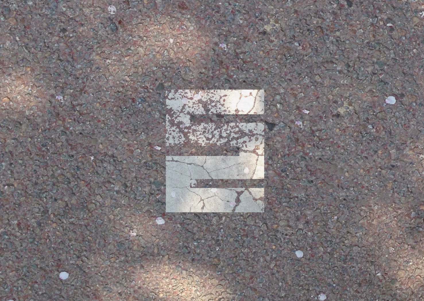

Dol(Stone)
Logo / Leaflet / etc / May.2015
Logo / Leaflet / etc / May.2015
돌은 선인(先人)들의 삶의 방식을 현재와 미래의 문화예술에 투영(投影)하는 디자인 커뮤니티입니다. 주로 전통적인 석조문화를 표현하고 공유하는 활동과 문화확산 프로젝트를 진행합니다. 본 로고는 자음 ㄷ과 ㄹ을 조합한 것으로 ㄷ에서 ㄹ(위︎︎︎아래)로 이어지는 획의 동선은 [과거-현재-미래]를 잇는 의미를 나타냅니다.
Dol (돌) means stone in Korean. Dol is a design community that accurately expresses Korean traditional culture (mainly stone cultural properties) and projects the way of life of the ancestors into the present and future culture and arts. This logo is a combination of the Korean consonants ‘ᄃ’ and ‘ᄅ‘ with minimal pixels. The path of the line leading to [top︎︎︎bottom] implies the meaning of connecting [past-present-future].